UX Designer
Q2 2024
The user wants to purchase a web hosting package but is not completing the payment.
User data analysis on the Niagahoster website shows that 45% of users only get to the web hosting package checkout stage but do not complete the payment.
Problems were identified through user research conducted with individuals who have used hosting services before. The research aimed to uncover issues experienced by users.
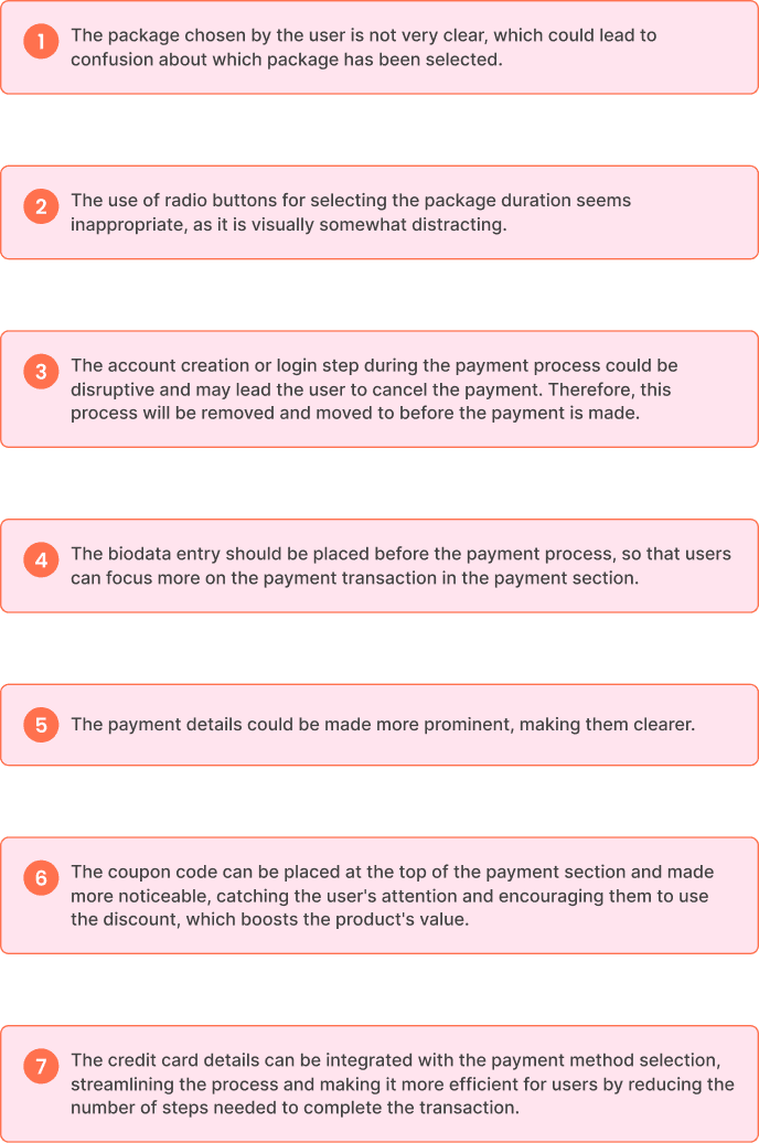
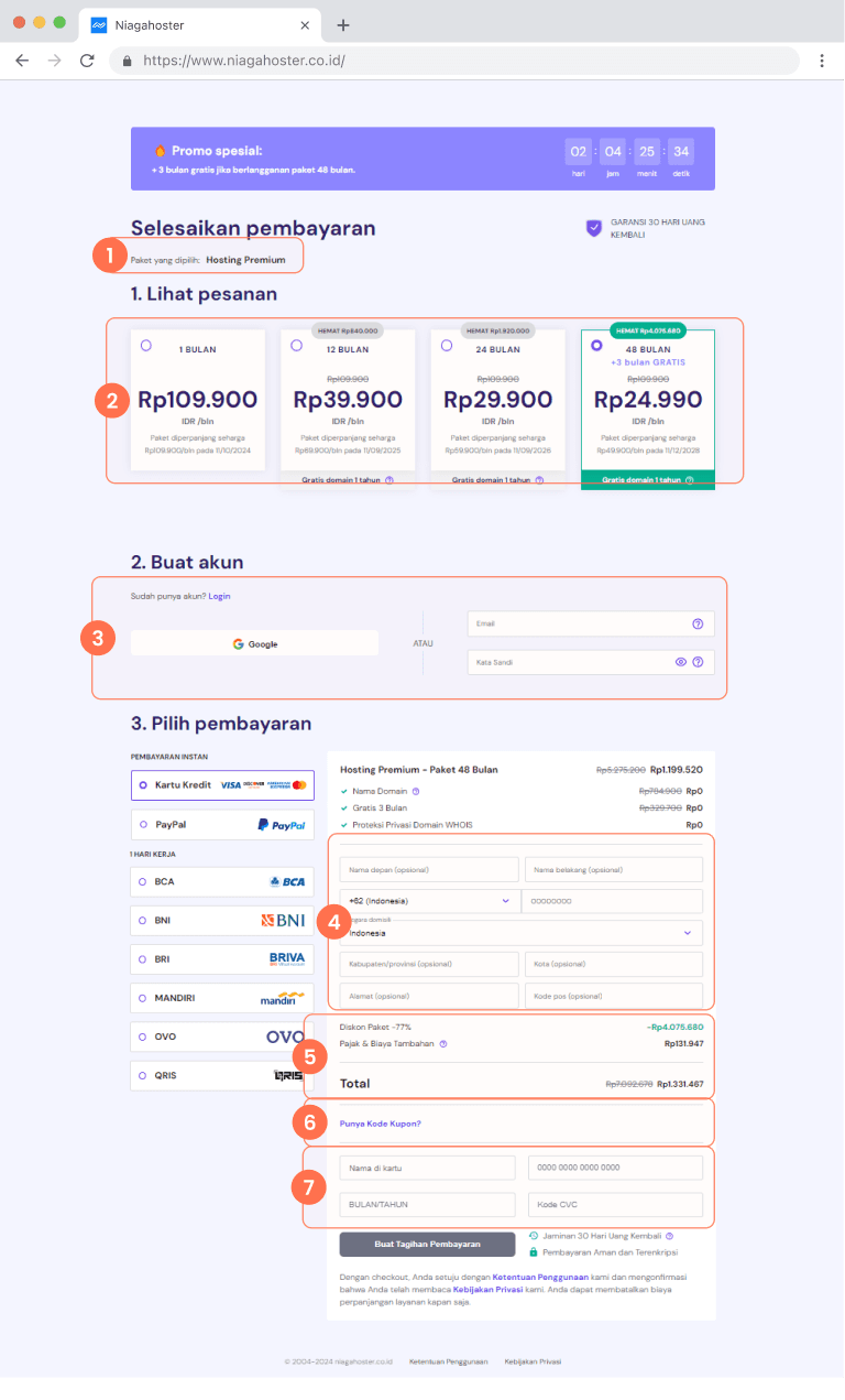
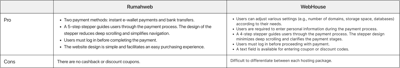
By looking at competitors with the same feature and products as other similar website, we see that they have advantages that Niagahoster does not have. Therefore, the improved design will be based on other similar web to create familiarity for users.
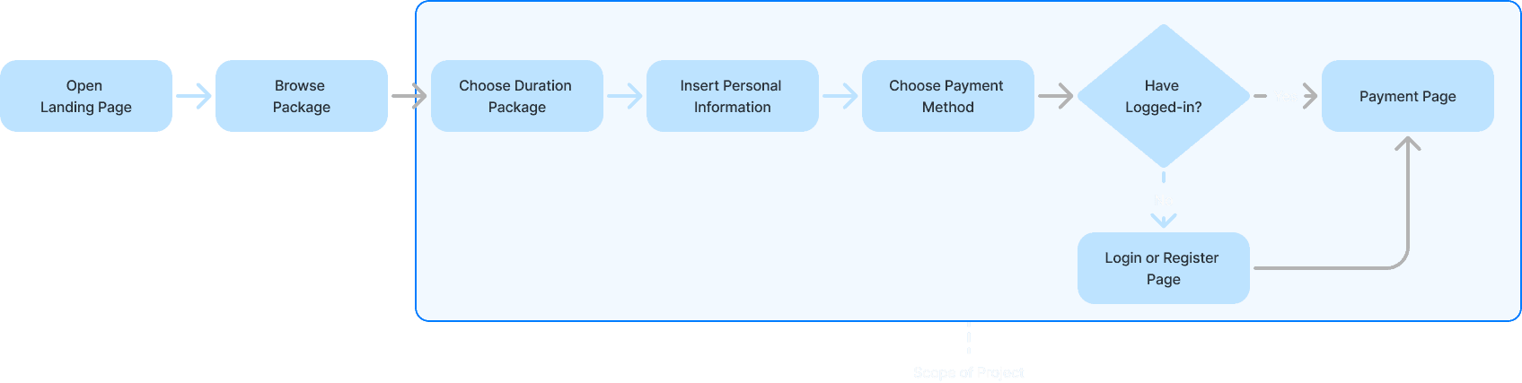
By starting with this wireframe, I was able to validate the structure and user experience before moving into high-fidelity visual design. This allowed me to quickly iterate and refine the interaction patterns based on user feedback.
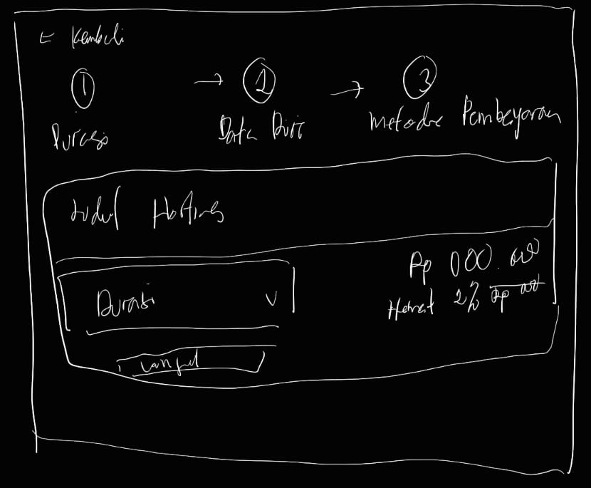
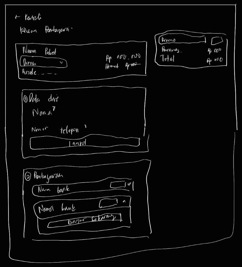
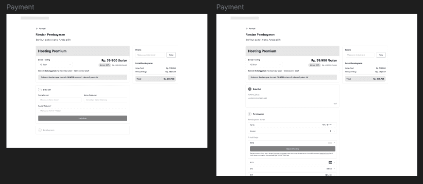
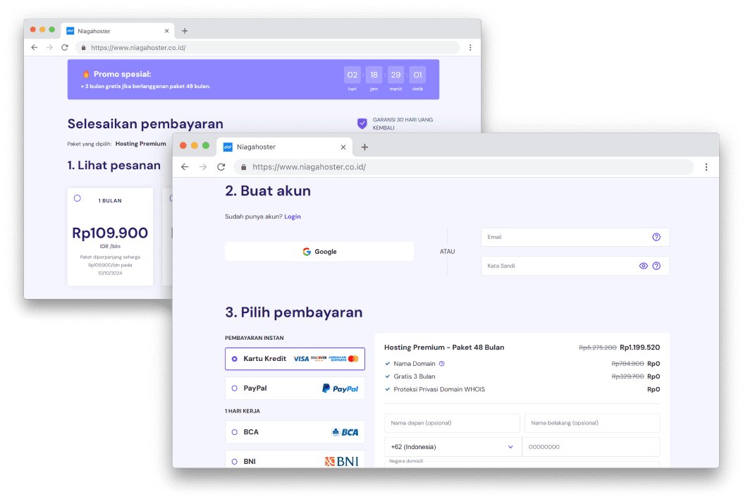
Dropdown for Duration Option: Simplifies the user's decision-making process with minimal cognitive load. It's clean, intuitive, and focuses on clarity.
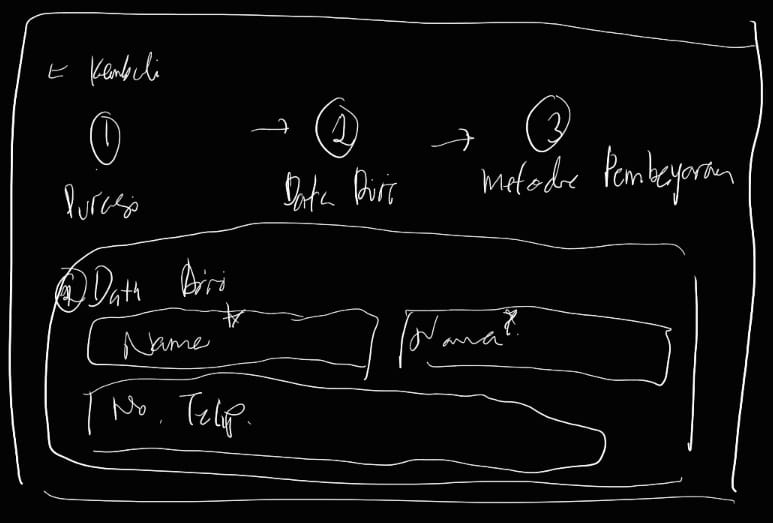
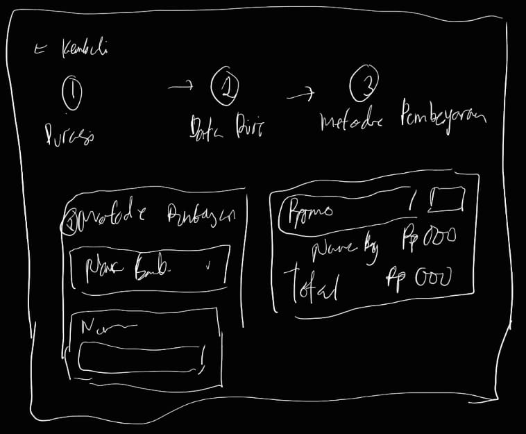
Progressive Disclosure in One-Page Checkout: Ensures a seamless user experience by showing only the necessary information at each stage, keeping the checkout page clean and reducing distractions. This increases the likelihood of users completing their purchase.
Login with "One Step Closer": Reassures the user with a motivational message. It ensures that the user remains engaged and more likely to complete the purchase.
TCR
100%
100% of users successfully completed the payment process without issues, with an average completion time of less than 2 minutes.
7/7
Majority of users say that the checkout process is “seamless”.
CSAT
97.75%
Overall, the checkout process is satisfying for most participants. Several reasons are seamless, user-oriented, and clear.
When designing selection interfaces, focus on reducing cognitive load rather than maximizing options
Breaking complex processes into smaller, focused steps increases completion rates and user satisfaction
Strategic placement of encouraging micro-copy can transform potential drop-off points into engagement opportunities
Together, these solutions demonstrate how reducing friction, managing cognitive load, and providing emotional support create a more compelling user experience