Adaptive Design System Using Figma Variables
Here is my process of creating an adaptive design system using Figma variables to seamlessly handle both light and dark modes. The system prioritizes accessibility, usability, and maintenance efficiency.
Role
UI/UX Designer
Timeline
Q1 2025
Problem Statement
When I joined SmartM2M as the only designer on deck, I faced the enormous challenge of developing a scalable system that would allow me to create and maintain cohesive light and dark themes without duplicating effort, while simultaneously ensuring both themes met strict accessibility standards and preserved our distinctive brand identity.
Research
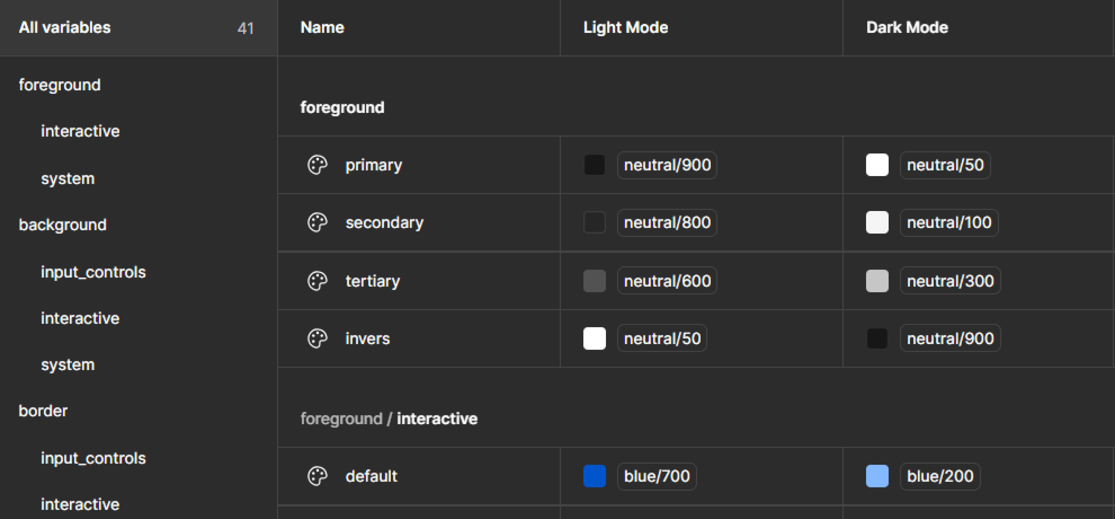
I start with exploring design systems from big companies like Material, Carbon, Atlassian, or Fluent to learn about their semantic naming style. From that research, semantic color sets can be broken up into 3 main categories that all work together to style all UI elements.
Foregrounds
Text, icons, and any elements that sit on top of a background.Backgrounds
The background color of individual UI elements and whole sections or bodies of content.Borders
The stroke or outline color of individual UI elements or lack thereof.


Maintainable semantic names
Naming semantic was the hardest part for me when building a design system. It should be flexible, adaptable, and scalable. Through this project, I found that semantic names are maintainable. Therefore, I breakdown the main categories to help me define styles for our system.
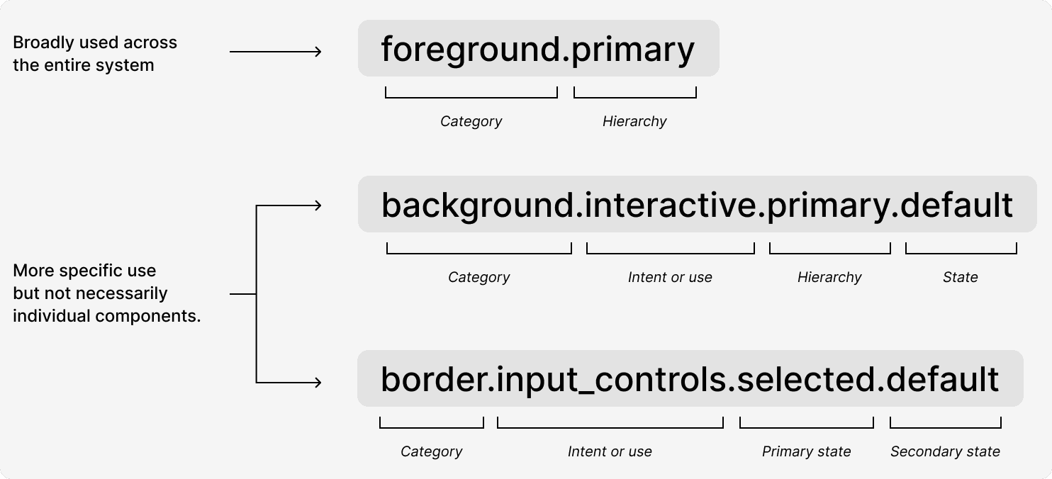
Semantic naming structure
System-wide color styles
In our design system, color styles prioritize simplicity and reusability. Components typically inherit a standard color palette, using broad style definitions like "foreground.primary" instead of overly granular options. I introduce more specific color variations—such as state-specific foreground colors for interactive elements—only when they provide clear, meaningful visual feedback that enhances user experience and interaction clarity.
Specific color styles—Intent or use
The second level of color styles defines intent and usage across key categories.
Interactive styles cover more than just buttons, anticipating future custom interactions with hierarchies like primary, secondary, tertiary, and quaternary—each with detailed states like default, hover, and focus.
Input controls share styling principles, encompassing everything from text fields to toggles, with nuanced selected and unselected states.
System styles handle critical feedback components like alerts and error messages, focusing on informative, success, warning, and error states, with particular emphasis on error states that require user action.
By organizing colors this way, I create a flexible, comprehensive approach that supports consistent design while allowing for future expansion and specific interaction needs.
Setting up semantic names
Picking colors for light mode and dark mode
Saturated colors are easy to convert from a light theme to a dark theme using symmetry. I currently have 10 swatches set up in each palette. If the swatches are divided in half, each half becomes a mirror.
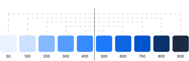
For instance, if a button color is 700 in light theme, it will be 200 in dark theme. If a section message background is 50 in light theme, it will be 900 in dark theme.
Styling a component
Let’s look at how foregrounds, backgrounds, and borders work together to style a component.
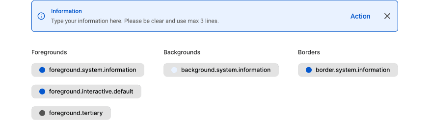
Example of styling component
The above example, I have a information variant of a feedback banner. Each category has a “.system.information” sub-category. I am still using foreground.tertiary for the description and icon button. Also, using the foreground.system.information for the tittle and icon. And, using foreground.interactive.default for action button.
Contrast Test
While colors look different in light and dark modes, the contrast ratio remains consistent, meeting WCAG (Web Content Accessibility Guidelines) AA standards (≥4.5:1) for labels. This ensures readability and accessibility regardless of the theme.
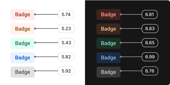
Example of the contrast test result using WCAG
Lesson Learned
Challenges Overcome
Initial complexity in variable architecture required thorough documentation
Balancing flexibility with consistency required clear governance rules
Transitioning existing designs to the new system required dedicated migration time
Future Improvements
Integration with design tokens export to connect directly with development
Additional modes for colorblind users
What Worked Well
The semantic token approach created clear separation between brand colors and their application
Mode switching provided immediate visual feedback during design reviews
Variable aliases maintained relationships between colors even when base values changed
Impact & Outcomes
The adaptive design system has been implemented across three product lines, resulting in:
40% faster theme implementation
65% reduction in design inconsistencies
100% WCAG compliance across all products
Streamlined developer handoff process